June 10, 2026
How to Prepare Artwork for Leaflet Distribution
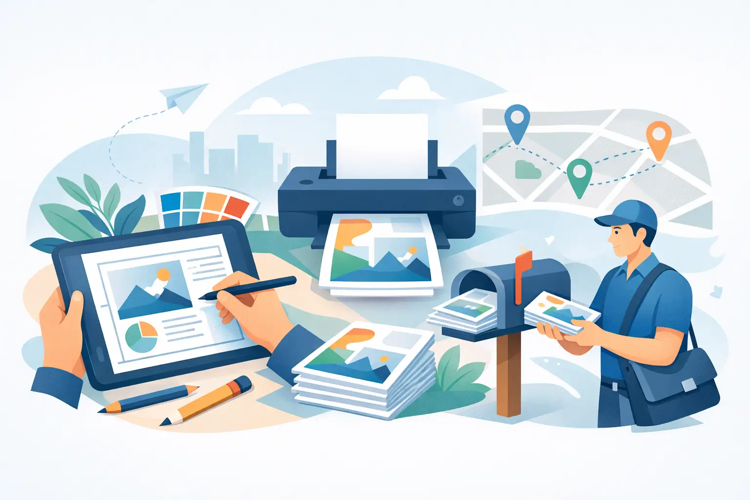
Learn how to prepare artwork for leaflet distribution with the right size, bleed, layout and print setup so…
Read article
A leaflet has only a few seconds to earn attention. It lands on the mat with takeaway menus, utility post and local promotions, so weak design gets ignored fast. The best leaflet design tips are not about making something look clever. They are about making sure your offer is noticed, understood and acted on.
If you are paying for print and delivery, every part of the design needs to do a job. Good leaflet design helps the reader grasp who you are, what you offer and why they should respond. Poor design wastes coverage, even if the targeting is right.
The first rule is simple. Design for response, not for decoration. A leaflet is not a company brochure and it is not a branding exercise for its own sake. It needs to lead the eye quickly from headline to offer to action.
That means being selective. Too much text, too many images and too many messages usually weaken the result. The stronger approach is to focus on one main service, one clear audience and one next step.
Many leaflets fail because they try to promote everything at once. A plumber includes boiler servicing, bathrooms, emergency call-outs, landlord certificates and drainage work, all at equal volume. A restaurant pushes lunch deals, evening dining, catering and private hire on the same panel. The reader ends up with no clear reason to act.
Choose the main message before you start the layout. If the priority is bookings for a seasonal service, lead with that. If the priority is launching a new business in one area, make the introduction and offer the focal point. Secondary services can still appear, but they should support the main point rather than compete with it.
Your headline is the first real test. Generic lines such as “Quality Service” or “We Care About Our Customers” are too vague to carry the leaflet. They do not tell the reader what you do or why it matters.
A better headline is specific and commercial. It should quickly explain the benefit or the offer. “Boiler Servicing from a Local Gas Engineer” is stronger than a slogan. “20% Off First Clean” is stronger than a statement about excellence. Clarity usually beats cleverness.
Most people do not sit down and study a leaflet. They scan it. That changes how the design should work.
Short blocks of copy are easier to absorb than dense paragraphs. Key information should stand out at a glance. If someone can understand the basics in five seconds, the leaflet is doing its job.
Good hierarchy means the reader knows where to look first, second and third. In most cases that order should be headline, main image or offer, supporting details, then contact information.
Font size, weight, spacing and placement all matter here. If everything is bold, nothing stands out. If the contact number is tiny, response drops. If the main offer is buried at the bottom, it may never be seen.
A practical test is to step back and look at the leaflet from arm’s length. If the most important message does not jump out, the layout needs work.
There is no prize for squeezing in more words. Readers want the essentials. What are you offering, who is it for, what makes it worth considering and how do they respond?
That does not mean every leaflet should be sparse. Some services need a little more explanation, especially if trust is a factor. But even then, every sentence should earn its place. Remove filler, repeated claims and vague marketing phrases.
Photos can help, but only when they add clarity or confidence. A poor-quality stock image often does the opposite. It makes the leaflet feel generic and forgettable.
If possible, use real images of your work, premises, products or team. For local service businesses, this tends to build more trust than polished but impersonal visuals. A before-and-after image, a well-shot product photo or a clean image of completed work can all strengthen the message.
There is a trade-off here. Not every business has strong original photography ready to use. In that case, it is better to use one simple, relevant image than to clutter the leaflet with weak ones just to fill space.
Colour should guide attention, not create noise. A bright accent can draw the eye to an offer or call to action. Brand colours can help with recognition. But too many competing colours make the leaflet feel busy and harder to process.
Contrast matters more than decoration. Dark text on a light background is usually easiest to read. Pale grey text, busy image backgrounds and low-contrast combinations can make important details disappear, especially in smaller print.
In local print marketing, trust carries a lot of weight. Readers are deciding whether your business feels credible enough to contact.
This is where design and content work together. A tidy layout, readable fonts and strong print quality all help. So do practical trust signals such as years established, qualifications, review snippets, guarantees or a clear local presence where relevant.
Big promises can backfire if they sound exaggerated. Claims such as “best in the UK” or “number one for everything” rarely help on a leaflet unless they are backed by something meaningful.
Plain, believable proof works better. “Established since 2010”, “fully insured” or “fixed-price quotations” are examples of details that reassure without sounding inflated. The exact trust signal depends on the service, but it should be relevant to the customer’s decision.
This sounds obvious, yet it is often mishandled. A leaflet can look sharp and still underperform if the phone number, email address or booking route is hard to find.
Place contact details where readers expect them, and repeat them if space allows. If phone calls are the main goal, make the number prominent. If you want people to book online or request a quote, say that clearly. The action should never feel vague.
One of the most overlooked leaflet design decisions is format. Size, fold and finish all affect how the message is received.
For a simple offer, a standard flat leaflet often works well because the message is immediate. For a service with several benefits or packages, a folded format may give you more room to structure information properly. Larger formats can create impact, but they also cost more to print and can be harder to keep visually clean.
The best choice depends on the campaign. A low-cost, high-volume local offer needs a different design approach from a premium service aimed at a smaller area.
People usually view leaflets quickly, often standing in the kitchen or hallway. Small text, overcomplicated layouts and long explanations are even less effective in that setting.
That is why simple formats often outperform more elaborate concepts. If the offer can be understood instantly, you are giving the campaign a better chance.
A leaflet aimed at homeowners in one postcode sector may need a different angle from one aimed at students, tenants or families. The offer, imagery and wording should reflect the audience you want to reach.
For example, a premium home improvement service may benefit from a cleaner, more spacious design with fewer claims and stronger visuals. A value-led household service may perform better with a bold offer, clear pricing cues and more direct wording. Neither approach is right in every case.
This is where local targeting and design should work together. If you are planning distribution in places such as PE1 to PE7, the more closely the message fits the households receiving it, the better your chances of generating worthwhile enquiries.
One expensive mistake is approving a design based only on how it looks on screen. Print changes things. Colours can shift, text can feel smaller and spacing that seemed fine on a monitor can look cramped on paper.
Always check a printed proof. Better still, get a second opinion from someone who has not been involved in creating it. Ask them what the leaflet is offering, who it is for and what they would do next. If they hesitate, the message probably needs tightening.
Testing also applies to campaigns. If budget allows, trial different versions of the headline, offer or format before committing to a wider run. Small changes can make a noticeable difference in response.
Even the strongest leaflet will struggle if it reaches the wrong homes or arrives with no campaign logic behind it. Design and delivery should be planned as one job, not two separate tasks.
That means thinking about area selection, quantity and timing at the same time as layout and messaging. A well-designed leaflet with a weak offer will still underperform. A strong offer with poor design can be missed. The best results usually come when the audience, message and delivery plan are aligned from the start.
If you want your print spend to work harder, keep the design simple, specific and built around action. A leaflet does not need to win awards. It needs to get picked up, understood and remembered long enough for someone to make contact.
Ready to plan your next leaflet campaign?
Get a Free Quote
Learn how to prepare artwork for leaflet distribution with the right size, bleed, layout and print setup so…
Read article
How long do leaflet campaigns last? Learn what affects response times, when to repeat distribution and how to…
Read article
Leaflet distribution PE6 for local businesses that want reliable delivery, postcode targeting and better response from every campaign.
Read article